Interpreting the arrows and colors
The arrows and colors that are shown on a table indicate the statistical significance of the results (i.e., they indicate the results of significance tests).
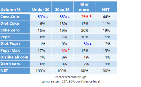
Where the table shows a crosstab, the colors and arrows indicate whether the value in the cell is significantly higher than than the typical response for that row of the table. For example, in the table below, the blue font and the arrow pointing up indicates that people that are aged under 30 are more likely to have chosen Coca-Cola than are all the people that are not aged under 30 (i.e., people aged 30 or more). 
Where the table shows a single column of numbers then the statistical significance indicates whether a particular number is higher or lower than the typical value shown in the other cells. Note that the tests are always conducted on the default statistic (i.e., if the table initially shows % and you change this to Base n, the tests will still relate to the %) and NETs are ignored.